
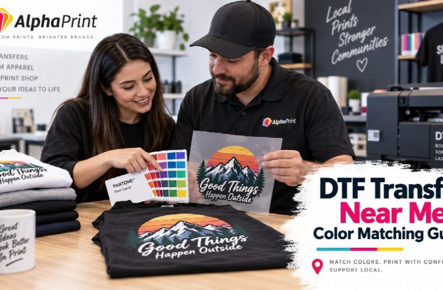
Searching for a DTF transfer near you often starts with convenience, but local access can also make visual communication easier. When a new transfer needs to coordinate with an existing shirt, logo sample, package, or branded item, a physical reference can be more useful than describing a color as “bright red,” “navy,” or “close to our old print.”
A physical sample does not guarantee an exact print match. Different materials, inks, films, screens, and lighting conditions can change how color appears. What the sample does provide is a shared reference that helps you explain what you are trying to reproduce before production begins.
Choose the Best Physical Reference
Bring the item that represents the result you actually want, not simply the easiest object to find. If the goal is to reorder staff shirts, an approved shirt from the previous run is usually more useful than a screenshot of the company website. If the transfer must coordinate with packaging, bring the package. If a client approved a printed brand guide, bring that printed piece.
When evaluating a DTF transfer near me option, ask how the provider wants reference materials supplied or discussed. A local conversation is most helpful when both sides are comparing the same object and the same target.
Do Not Treat Screens as Color Standards
Phones, laptops, and monitors can display the same file differently. Brightness settings, screen calibration, display technology, and room lighting all affect what you see. A color that looks correct on one device may look warmer, darker, or more saturated on another.
That is why a screenshot should not be your only reference for a sensitive reorder. Use the original artwork file when available, and pair it with a physical example when the existing printed appearance matters.
Identify What Must Match
Not every color in a design has the same importance. A business may care most about its primary logo color, while a sports group may need jersey numbers to remain consistent across a season. A merch seller may care about the overall visual family rather than an exact technical match.
Before speaking with the printer, define the priority:
- Primary brand color
- Secondary brand color
- Skin tones or photographic elements
- Neutral grays or blacks
- Consistency with a previous transfer run
This helps the provider understand where small variation is acceptable and where it is not.
Compare the Same Kind of Surface
Color perception changes with the background. A transfer viewed on a white shirt can feel different from the same artwork on black, navy, or heather fabric. Surface texture also changes how the final design is perceived.
If your reference is a finished garment, tell the printer what garment color and material will be used for the new order. When possible, compare samples under similar conditions instead of placing a glossy printed card next to a finished textile and expecting them to look identical.
Bring the Original Artwork File
A physical sample shows the target appearance, but the digital file gives the printer usable production information. Bring the highest-quality source file you have. Avoid rebuilding an old logo from a compressed social-media image if the original art is available.
If you need a new production version rather than a simple reorder, explore the available custom transfers and prepare the artwork with the final application in mind. Clean edges, correct dimensions, and a transparent background make the production conversation much clearer.
Use Consistent Lighting for Visual Checks
A color check under warm indoor lighting may look different near a window or under cool shop lighting. When reviewing a sample, look at it under more than one reasonable lighting condition. You are trying to identify major visual differences, not prove that two materials behave identically everywhere.
If the order is for retail merchandise, consider the environment where customers will usually see the product. If it is a uniform, think about the workplace lighting. This makes the approval decision more practical.
Ask for a Small Test When the Match Matters
If a job is large or the color relationship is critical, a small test can be more useful than debating color on a screen. The exact test process depends on the provider, order type, and production workflow, so ask what is available before assuming a proof will represent every final condition.
When reviewing a test, compare the target color first. Then check fine details, contrast, and how the artwork behaves on the intended garment. Record what was approved so the next reorder starts from the same reference.
Document the Approved Result
Once a transfer or finished garment is accepted, save the production file and label the physical reference. Include the date, job name, garment color, and any notes that would matter later. A photo can help identify the sample, but keep the actual approved item when practical.
This turns a one-time color conversation into a repeatable reorder process. The next person handling the job does not have to guess which red was approved or which shirt was the final version.
Use Local Access for Better Communication
The strongest reason to use a physical reference is clarity. It gives you and the printer something concrete to discuss. Instead of saying “make it look like last time,” you can point to the approved example, explain what matters, and confirm what can realistically be reproduced.
Color matching in DTF is a production conversation, not a promise that every material will look identical. A good local workflow combines the original artwork, a useful physical reference, realistic expectations, and a documented approval. That approach reduces ambiguity and makes future reorders easier to manage.


