
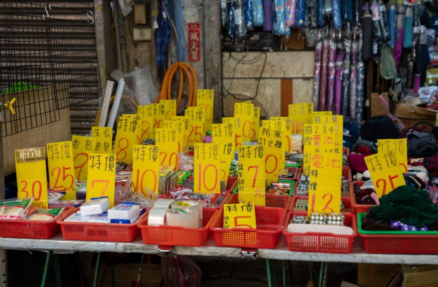
Pricing tags have a greater impact than most retailers realize. They do not just display a number; they shape how shoppers perceive value before a single word is read. The format, size, color, and physical placement of a price label all work together to influence whether someone picks up a product or moves on. Treating these details as an afterthought is a common mistake and one that quietly costs retailers at the shelf level.
How Label Design Affects Perceived Value
Shoppers process visual cues faster than conscious thought. A label’s weight, scale, and color start shaping perception the moment a shopper’s eye lands on it.
Smaller font sizes for prices tend to reduce perceived cost. Larger, bolder labels attract attention but can push the product into discount territory, which works against premium positioning. High-end retailers often keep labels minimal, using clean typefaces and generous white space to reinforce the sense of quality.
Color carries clear associations in retail environments. Red signals urgency and clearance. White or neutral tones read as standard pricing. Matte black or metallic gold finishes are frequently used at the premium end to bring the label in line with the product’s overall presentation.
The Role of Label Materials and Finish
Material quality leaves an impression at the point of contact. A poorly printed or flimsy label does real damage to product perception, regardless of how well the product itself is packaged.
Selecting the right price tag stickers for a retail setting means weighing durability, adhesive strength, and print legibility together. Labels used in cold storage behave differently from those placed in ambient-temperature sections. High-turnover environments require labels that peel cleanly without leaving adhesive residue on packaging.
Placement Rules That Influence Shopper Behavior
Where a price appears on the shelf matters as much as how it looks. Visual merchandising research consistently points to eye-level placement as the highest-converting zone. Products sitting between waist and eye height sells more reliably, partly because the price is readable without physical effort from the shopper.
Left-to-Right Price Anchoring
In markets where shoppers read left to right, product sequencing on a shelf creates natural price anchors. Placing higher-priced items at the left end of a display row establishes a reference point. Items positioned to the right feel more affordable by comparison, even when the actual price gap is small.
Shelf Edge Labels and Their Function
Shelf edge labels help shoppers scan a category without handling every product individually. A well-formatted shelf talker reduces decision friction and generally lifts conversion within that product group.
Uniform formatting across shelf edge labels also signals operational care. Mixed fonts, inconsistent sizing, or varying color treatments across a single shelf run introduce visual noise. That noise erodes shopper confidence in the accuracy of the pricing itself.
Psychological Pricing and Its Visual Execution
Charm pricing, where prices end in .99 or .95, remains a reliable tactic because the behavioral effect holds up across retail categories. Shoppers consistently encode .99 prices as meaningfully lower than the nearest round number, even with full awareness of the one-cent difference.
For charm pricing to work visually, label design needs to support it. Setting the cents figure in a smaller typeface reduces its visual weight and reinforces the leading digit as the dominant number the shopper registers.
Bundled Pricing Presentation
Bundle labels need to do more than display a total. Showing the per-unit price alongside the bundle price gives shoppers a reference point that makes the value case immediately clear. Without that comparison, the bundle price has to justify itself, which is a harder ask.
Cluttered bundle labels increase cognitive load and slow down decisions. The strongest layouts keep hierarchy simple: the total price gets visual priority, and supporting details stay secondary.
Consistency Across the Store
A store-wide label system works best when it follows a consistent standard from one department to the next. Familiar label formats lower the mental effort required to navigate, and shoppers who move through a space without friction tend to spend more time in it.
Inconsistency in label formats, even minor variation in sizing or color coding, creates small moments of confusion that accumulate across a shopping trip. That cumulative friction has a real effect on dwell time and conversion.
Conclusion
Pricing labels operate at the intersection of function and communication. Their design, material quality, placement, and visual consistency all shape how shoppers read value and arrive at purchase decisions. Retailers who treat labeling as a deliberate merchandising variable, rather than a logistical necessity, are better placed to influence behavior at the shelf. In a competitive retail environment, that level of attention to detail tends to show up directly in conversion rates and average transaction values.


